Long-Running Tasks: Status Messages That Explain the Next Step
Design clear status messages for reports, imports and other long-running software tasks. Explain the state, last confirmed update and useful next action.
Essential Designs Team
|
October 7, 2026

Category: UI/UX Design | Custom Software | Web App Development
By Essential Designs Team | Published October 7, 2026 | Updated October 7, 2026 | 6 min read
A useful status message tells someone what the software is doing, how recently that information was confirmed, and what they can do next. A spinner alone cannot explain whether a report is waiting, running, available or needing attention.
For buyers planning custom software, this is a product decision as much as a technical one. An import, export or background calculation needs an understandable place in the working day, not just a loading animation attached to a button.
Key takeaways
- Acceptance of a request and completion of its work are different events.
- Describe the task state separately from the freshness of the status information.
- Only show progress figures, cancellation and retry actions that the underlying system can support.
- Give people a way to return to unfinished work without starting it again.
- Design status information for assistive technology as well as sighted users.
What should someone see after starting a long-running task?
Consider a fictional distributor preparing a monthly stock report. The operations manager selects a date range, requests the report and returns to other work. The report may be waiting behind other jobs before any calculation begins.
“Your report is ready” would be false. “Please wait” would leave the manager guessing whether they must keep the browser open. A more useful first message might be: “Report request received. Waiting to start. You can return to this task from Reports.”
That wording is appropriate only if returning really works. Product copy cannot manufacture persistence that the application does not have. The buyer and development team must agree how the request is identified, where it can be found again and what happens if the person closes the page.
Microsoft’s asynchronous request-reply pattern distinguishes acknowledging work from reporting its eventual outcome. It is one implementation pattern, not a requirement that every application use Azure or follow one architecture.
The interface should explain the business task, not expose infrastructure jargon. “Waiting to generate your report” is generally more useful to an operator than the name of a worker queue.
Which status labels belong in the interface?
Essential Designs recommends a three-part review for each visible state: state, freshness and next action. This is an editorial design model, not a claim about a measured client project.
| Visible state | What it means in this example | Useful next action |
|---|---|---|
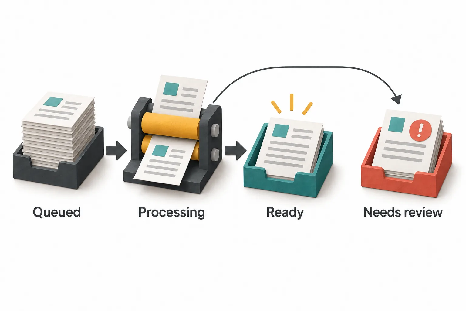
| Queued | The application accepted the report request but has not started the calculation. | Return later or view other reports. |
| Processing | The report job has started and has not reported a final outcome. | Continue other work; view the last confirmed update. |
| Ready | The finished report is available. | Open or download the report. |
| Needs review | The job found an issue that requires a person's decision. | Read the specific issue and follow the approved resolution route. |
The featured diagram illustrates processing branching to either ready or needs review. It does not imply that every completed report must enter review.
Labels need definitions before they need colours. If one screen says “Complete” when a file has been created and another uses the same word when a person has approved it, the application has two meanings for one status.
Review the state map with the people who receive the result. Their next step might be to inspect a draft, obtain approval or publish it. A technically successful calculation may still produce something that is not yet ready for that next business action.
How do you distinguish an old update from a failed task?
Now imagine the manager opens the report page on an unreliable connection. The page last confirmed “Processing” several minutes ago. That observation does not prove the job is still running, and a failed status refresh does not prove the report job failed.
The interface can separate those facts: “Last confirmed: processing at 10:14. We could not refresh the status. Try checking again.” Avoid converting uncertainty into a definitive failure message.
Show a meaningful time with sufficient context, especially when teams work across time zones. Explain whether it describes the task itself or the page's last successful check. “Updated just now” should not merely mean that the browser repainted an old response.
The underlying status contract needs a reliable source for these distinctions. Buyers can use our existing API integration contract article for that separate backend discussion. This article concerns how the resulting information helps the user decide what to do.
When is a progress bar useful?
A percentage is useful when the software measures a defined amount of work. For example, processing a known number of independently counted records may provide a meaningful basis. It becomes misleading when several unequal stages are compressed into an invented steadily increasing number.
A report can finish reading records and still need to perform an expensive calculation or create a file. “90 percent” may suggest that the remaining time is short even when the system cannot know that.
If reliable numerical progress is unavailable, show the real stage and useful context instead: “Calculating totals” or “Creating the download file.” Do not attach a completion-time promise unless the application has a defensible basis for it.
Avoid making a person watch motion to discover that nothing has changed. A readable state, a return path and an honest explanation of uncertainty can be more useful than elaborate animation.
What should retry and cancel actually do?
These actions change behaviour, not just wording. A “Check again” button can refresh status without creating a new job. A “Retry report” button may start new work. Treating them as interchangeable risks duplicate tasks and confusing results.
Similarly, cancellation may stop queued work immediately but only request that active work stop when it reaches a safe boundary. The label should match the implementation. If the request is still being processed, show “Cancellation requested” rather than claiming the job has already stopped.
Decide what happens to any partial output and how the person recognises the final outcome. Do not offer a cancellation control that simply hides the progress screen while work continues.
For a buyer, the useful questions are concrete: Can this action create duplicate reports? Does cancelling preserve the previous completed report? Who can resolve a needs-review item? The answers belong in the requirements for the feature.
How will someone using a screen reader receive the update?
A visual change is not automatically available to every user. W3C’s guidance on status messages addresses making relevant status changes programmatically available without requiring users to move focus to them.
Ask the design and development team how a waiting, success or error update will be communicated. Do not continually interrupt someone with repeated announcements of an unchanged state. Test meaningful updates in context, including while focus is elsewhere in the application.
Also make the state understandable without relying on colour alone. A coral review indicator needs a text label and an explanation of the issue. An icon needs an accessible name where it carries information.
These checks do not establish complete accessibility conformance. They are a focused part of designing and testing this feature.
What should buyers agree before approving the feature?
Walk through one ordinary task from request to result, then repeat it with a stale connection and an issue requiring review. Ask a person unfamiliar with the design to explain what happened and what they would do next.
Record the agreed meaning of every state, its information source, its permitted actions and its return location. Include who owns unresolved tasks after launch; software support needs enough context to distinguish an unfinished job from an inaccessible result.
For custom software development, the goal is not a more impressive spinner. It is an interface that lets people leave, return and act without guessing about the work.
If you are defining a business application with reports, imports or other background tasks, discuss the workflow with Essential Designs.
Sources
- Microsoft: Asynchronous Request-Reply pattern.
- W3C: Understanding Success Criterion 4.1.3, Status Messages.
Sources reviewed October 7, 2026. The report scenario, state table and design review are original editorial examples, not descriptions of a client system.

Essential Designs Team
October 7, 2026